The aim of the last assignment was to tell a story with pictures, and apply some of the techniques described in this part of the course.
I decided to create a travel guide or a small brochure for somebody traveling around Estonia, and took one place outside Tallinn as an example of where the one could go. It is a small town on the north-western part of the country - Paldiski.
First of all, I will show the images that I have included into the assignment.
The first picture is a view of the coast line. Probably, it is one of the most interesting things to see in Paldiski. That's why, I would put it on the cover page of the brochure.


The next one is to continue the story about the the coastline that was started on the cover of the brochure.


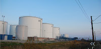
And as a separate chapter of the trip - some pictures of the industrial part of the town..
These pictures are more like strange symbols of industrial content of the town - black leaves, bricks, walls on the background, broken windows, and a graffiti - "Merry Nuclear Christmas" and "Do not Smoke!".

A couple of very straightforward objects of industrial content of the town.
And a logical final shot for the trip - getting dark, sun going down... the end of the trip...


I decided to create a travel guide or a small brochure for somebody traveling around Estonia, and took one place outside Tallinn as an example of where the one could go. It is a small town on the north-western part of the country - Paldiski.
First of all, I will show the images that I have included into the assignment.
The first picture is a view of the coast line. Probably, it is one of the most interesting things to see in Paldiski. That's why, I would put it on the cover page of the brochure.

18mm; f/13.0; 1/80 sec; ISO 200
Starting the story with arrival to the place...
18mm; f/5,6; 1/160; ISO 200

12mm; f/7.1; 1/160sec; ISO 200
The only reason to shoot this cat with wide angle lens was to manage to catch this moment...

12mm; f/7.1; 1/160 sec
The next two pictures I would use in combination, as an example of juxtaposition, and showing some of the interesting objects on the coast...

90mm; f/10.0; 1/200; ISO 200

14mm; f/13; 1/100 sec; ISO 200

14mm; f/13.0; 1/100 sec; ISO 200
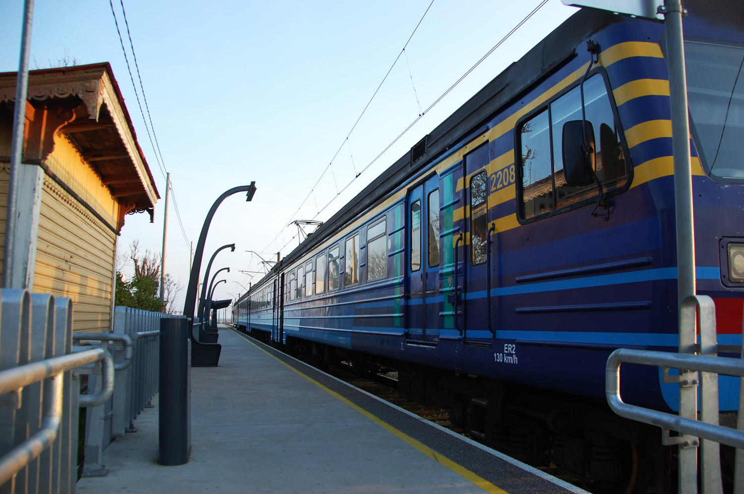
Continue the story with a couple of shots from the town itself, and another example of juxtaposition...

12mm; f/6.3; 1/100 sec; ISO 200

92mm; f/6.3; 1/60 sec
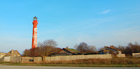
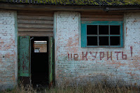
And as a separate chapter of the trip - some pictures of the industrial part of the town..
These pictures are more like strange symbols of industrial content of the town - black leaves, bricks, walls on the background, broken windows, and a graffiti - "Merry Nuclear Christmas" and "Do not Smoke!".
65mm; f/5.6; 1/80 sec

38mm; f/5.6; 1/100 sec; ISO 200
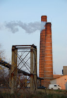
A couple of very straightforward objects of industrial content of the town.

65mm; f/6.3; 1/100 sec; ISO 200

18mm; f/6.3; 1/100 sec; ISO 200

185mm; f/6.3; 1/125 sec; ISO 200
And here is the brochure that I would put together with the pictures above. This would be a small brochure, from three parts, that are put together, and can be one of those advertising stuff that can be normally found for free in the hotel, trains or bus stations, airports, etc.