The idea of the task was to take 6 pictures, each representing one color out of the spectrum. What makes this task more complicated that it should not be artificial objects, like red door or blue teapot. The objects should be more natural instead.


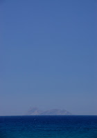
6. Blue
This shot has been taken on Create Island last summer. I just decided, that it would be good to use it, as it shows different tones of the blue, including 'classical' blue from the spectrum of colors.
I must admit, that fulfilling such exercise in the mid of March in Estonia is a complete disappointment! The only colors you can find here this time is grey and white, because of the amount of melting dirty snow and cloudy sky. If it was autumn, I could easily take 6 nice landscape pictures that would work perfect for this exercise. Unfortunately, this time I should mostly limit myself to macro pictures and use some of my earlier pictures. I just decided that they are good enough for the exercise and it would be a mistake to use something worse instead.
So, first of all, here is the colors spectrum that I had to represent in the exercise:

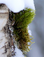
1. Green.
This is one of the few green things that you can find outside in this season of the year.

90mm; f/3.2; 1/600 sec
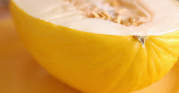
2. Yellow
What can be more yellow than a melon on a yellow plate? It seems like the focus could be moved a bit upward. And I am not very sure about the composition. It looks strange...

90mm; f/4.5; 1/40 sec
3. Orange
This is a lantern light in the night with a lot of insects on it. This is one of the older pictures taken in summer.

155mm; f/6.3; 1/1000 sec
4. Red
The good thing about this picture is tat it has different tones and variations of red color, from the most saturated red berries to slightly rose leaves.
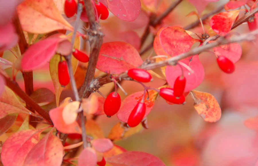
250mm; f/6.3; 1/60sec
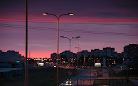
5. Purple
This picture was taken in October last year from one of Tallinn bridges. I remember this amazing evening, all kinds of colors in the sky, and when sun was nearly in down, it became deep purple.

120mm; f/6.0; 1/3 sec
6. Blue
This shot has been taken on Create Island last summer. I just decided, that it would be good to use it, as it shows different tones of the blue, including 'classical' blue from the spectrum of colors.
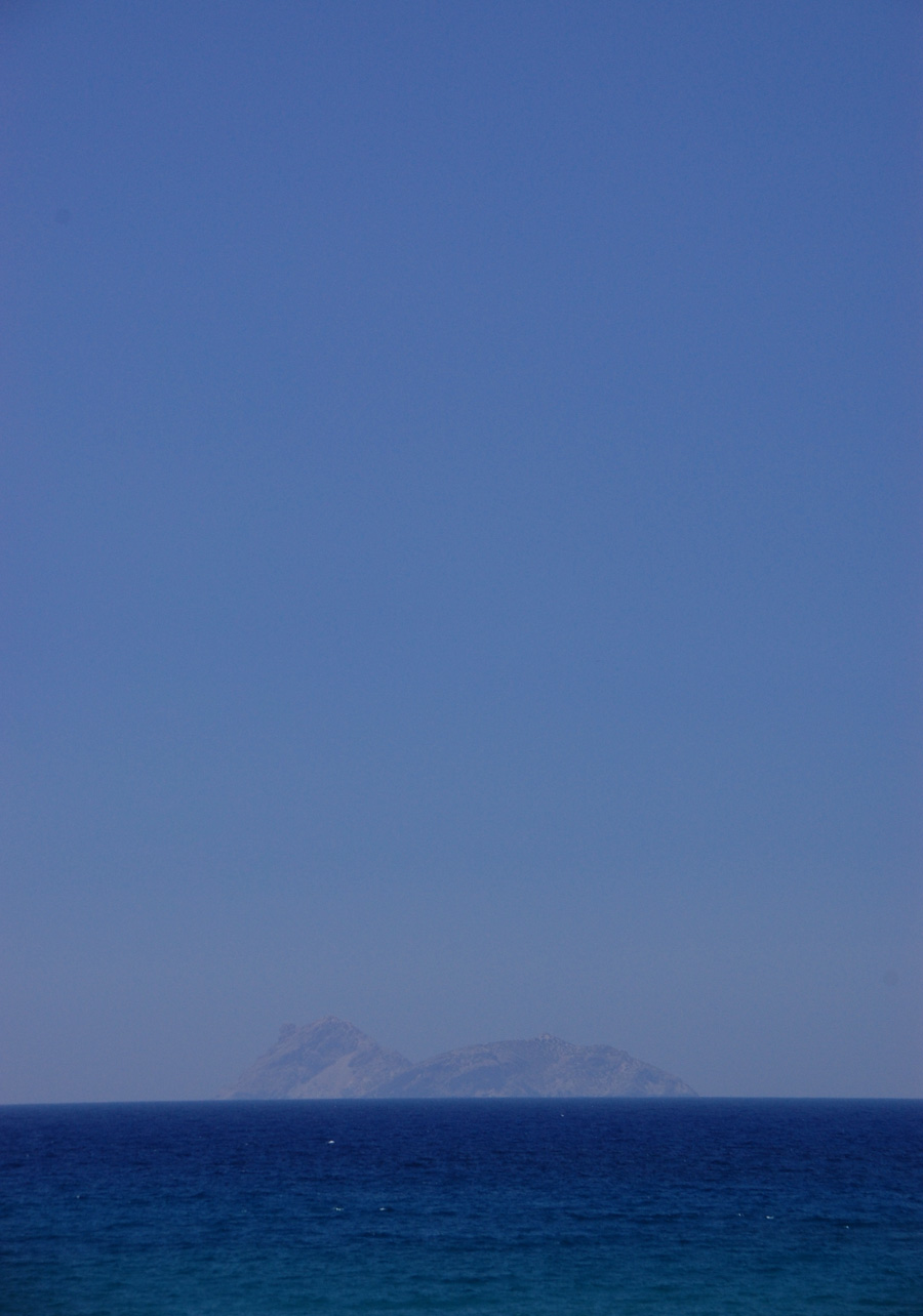
85mm; f/10.0; 1/250 sec
This exercise shows the diversity of the colors and by taking each picture at different exposures, I could again learn the importance of the color saturation.