Sunday, January 9, 2011

Exercise 2.4 - Horizontal and Vertical Lines

The task was to take pictures of the horizontal and vertical lines. I decided to shoot both outside and inside objects for this and used my Tamron f2.8 90mm for inside macro objects and Tamron f3.5-6.3 18-250mm for outside objects.

Here are the horizontal ones:

1. This was a first object that came to my mind when thinking of horizontal lines. Because I wanted this shot to be evenly sharp, I used aperture of f.20 and a bit longer shutter speed of 1.3 sec. It might be that cropping more to the level of a single line would make this picture more interesting, but I decided to leave it as it is.


2. Another inside object that I decided to picture was a set of magazines on the shelf. Due to the lighting conditions, the shutter speed here was very long - 15 sec and again, to make the wording on the top magazine visible, I used a quite small aperture of f.18.


3. For outside objects I went to the railway station. The snow,  old trains standing on a distance and the rails together created a set of lines. The mistake that I have made here was leaving ISO at 1600, though there was no real reason for this. I have just forgotten to change the setting back. That's why, I converted the image into black and white, to make the amount of noise a bit more justified.  


4. As it was not see from the distance, I zoomed the train to the longest focal distance of 250mm, where lines of snow complemented each other, creating a set or lines.


Vertical lines:

1. The curtain here creates an impression of straight vertical lines. The lights on the background are just for making composition more interesting. Again, here is the the same mistake with ISO 1600. If it was set up in a right way, there would be less noise on this shot.


2. Probably not the best object for lines exercise, but still the shape of the building, corners contrasting with shadows and some background might qualify as a set lines.


3. The windows of these building are in a form of lines. Shooting from a sharp angle stresses the aim of this composition.


 4. The pattern on this old door says for itself. The strange lock just adds up to the composition.


Monday, January 3, 2011

Exercise 2.3 - Multiple Points

For this exercise I decided to go back to one of my previous attempts and following the advice of the the tutor take a picture of the small compact objects on the mirror, so that the mirror edges would not be seen in the frame.

As a background I have take some lights, part of the window and the reflection of a cup in the mirror. The candies themselves are the main objects reflected in the mirror. So, starting from a single object and further increasing the number of candies up to eight a ended up with quite a big number of shots. Then I have chosen 6 of them, as described in the task. Here they  are:


This time I have also experimented with a shutter speed to create different kinds of background. As can be seen, the background lights are smaller on the first three pictures, than on the other three. I have also a bit experimented with colors balance in these pictures, as can been seen from different tones of the colors on the background.


And finalizing this exercise, here is the final picture with the biggest number of points and I have shown by arrows the shape of the composition. It looks like  trapezium with a biggest point in the middle. I am still in doubt, whether this composition really works or not...

Wednesday, December 29, 2010

Exercise 2.2 - The relationship between points

Similar to the previous exercise, I have chosen different objects with different types of background to show different relationship between the two points in the frame.

1. Two stones on the white snow were chosen for the first type of composition. Remembering the exercise on the balance, I have placed a bigger stone closer to the center than the second one. I have also placed two objects so that there was a diagonal between them.


2. For the second shot I have chosen objects of the same size and placed on the same plane. As both objects are of the same size, I have placed them almost equally from the center of the frame. To make image more dynamic, I showed a clear diagonal between two objects and addition diagonal created by the reflections on the background adds up to the the dynamics of the picture.   


 3. For the third shot I have chosen more complicated points (the chimney and the lantern) as well as more complicated background. The image itself is quite dynamic, but I don't think the two points attract enough attention, when looking at the picture. It seems that the chimney is a bit too close to the edge. Generally speaking, the building looks more like a central object of the picture here, than lantern and the chimney.


This exercise proves that placing two points against each other as well as against the background is more complicated, than working with a single point in the frame. When changing the position, it is often that either the angle of one of the points or the background does not work. More variables makes the process of putting together the composition more complicated.

Exercise 2.1 - Positioning a point

For this exercise I have chosen objects with different kinds of background to see how the object would be positioned.

1. At first I have taken a picture of the leaf on the plain white snow with no other objects on the background. As the leaf is the only object on the picture, I have placed it on the left side, but vertically in the middle of the picture. I that grains of snow from a bit blurred white to clearly focused are driving the attention to the center of the leaf. Though, it might make the composition a bit static. I tried several other options. Placing the object vertically closer to the edges, leaves too much white background. Placing the point centrally, makes composition really static.      


2. For the second shot I have chosen an object with a little bit different background to see, which composition will work better in this case. The trees on the background are clearly dividing the frame. And I decided to place the point horizontally on the right side and vertically in the center of the remaining frame. I am not quite sure that this composition works, it might be worth putting the point vertically a bit closer to the edge...


3. For the third part of of the experiment I have chosen the background other than snow. The office building with some lights and a lantern on this background seemed to work well. I have placed the object exactly on the line with windows. The light from the building slightly moves attention to the lantern. The small reflections in the bottom part of the picture seem to complement the composition.   


Summarizing the exercise, I would say that though there are no clear rules for placing the point in one or another part of the frame, the central position is very unlikely to be justified. At least, none of my objects worked centrally. Generally, placing the point within the frame is highly driven by the type of the background. 

Thursday, December 23, 2010

Assignment 1 - Contrasts

As described in the course materials, the first assignment was to come up with 8 pairs of photos that would represent the contrasting elements. Here they are:

1. Liquid/Solid.

I am not quite sure, that these parts are only liquid and solid contrasts. I decided to make the liquid picture black and white, as it became more interesting. The picture of solid piece of ice on the contrary is colorful and I did not want to change it, because I liked the colors surrounding the object. I don't like the focus on the first pictures...To  be honest it looks a bit out of focus...and th composition is rather strange...


2. Big/Small

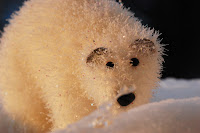
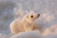
Here I used two Christmas tree toys in the snow. The big one is filling in the frame, it seems that he could hardly fit in there. The texture of the material  and the posture of the bear are saying that he is big. It is the other way around with a small one. He is in the center of the picture and all his posture and eyes make him look like a baby-bear.


3. Hot/Cold

The frozen berries look really cold on the snowy background. I have also tried to make coffe look as hot as possible by putting more focus on the smoke that is coming out of the cup.


 4. Straight/ Curve

For this pair I have chosen the different parts of the same pbject, which was my guitar. As a 'straight'  object I have take n a picture of strings, that always leave an impression of perfectly straight object. And the body of the guitar has a curved part, which I have shown on the second picture. I don't lie the reflection of the light on the second shot, but it was the best I could achieve.


5. Black/White

For black and white pair of pictures I have taken necklace from white agate and a black stone from northern part of  Russia - shungit. I am quite happy with a picture of the necklace, but I am not quite sure that the black stone leaves an impression of a black object.


6. Little/Much

For this contrast I have chosen a picture of some rice on the mirror. I like the reflections and the colorful background on the mirror. The picture of  'much' rice is quite doubtful in compositin. But I am not happy at all with these two pictures as a pair. They are two different to represent few/ many contrast. But anyway, here they are:


7. Dark/Light

It is really dark in the building of the old prison. And it is dark, not only because of the little light. It is the whole building, material and the hight of the room, that is giving impression of darksness. It makes people feel uncomfortable and lost.  The bright winter sun on the contrary would make everybody feel the freedom of the nature and gives positive emotions. I think, this pair works well for this assignment on contrasts.


8. Wide/Narrow

Here I have chosen widely open and narrow smiling eye as a contrasting pair. I am not very happy with focus on the narrow eye. It should be sharper than it is. the angle at which both pictures have been taken could also be better.


9. Light+Dark
This is a final picture representing both light and dark at the same time. I was also thinking to name it hard/soft, because of the softness of the sky, but decided that the branch looks not hard enough.
Both sky and white clouds leave a good impression of the light and the branch itself could not be darker than it is on this picture.


Summarizing this assignment, I would say that I am not very happy with my own work for several reasons.
First of all, I could probably have chosen better pairs for representing contrasts. Secondly, I could have put more efforts in setting up compositions. 
The post-processing could also be done in a way to stress the contrasts of the pairs, instead of. aiming at imroving every single picture.  
Anyway, it just means that I am still having a lot to work on. I am  looking forward to learn further and improve my skills.

Friday, December 10, 2010

Exercise 14 - Cropping

For this exercise I have picked up three different pictures to see how cropping would influence them and why cropping would be needed there or not.

1. Let's have a look at the first pair of pictures. The lighting was not perfect when taking this pictures, and it resulted in a bit blurred left side trees (though they were supposed to be sharp and too white sky in the right top corner. That is why, I have cropped these two elements that I did not like. I think the composition has even won from this, as there is now more attention to the bridge, which became more central than on the initial picture.


2. The nose and eyes of the seal were from the very beginning planned as central object. As it was not possible to come closer to the object than it is, I centralized and cropped the needed details. I also decided to leave some waves and bubbles to save the movement effec

3. For cropping this shot I referred to the exercise on the positioning the horizon. As it was advised there,  placing the horizon line exactly in the center makes the composition static. Also there was nothing really interesting in this sky to make it half of the shot. That's why I decided to cut some sky. I have also sacrificed some sand in the bottom to make the shot look more like panorama and attract  more attention to the grass and reflections.


Summarizing this exercise, I can conclude that cropping is a tool that should not be forgotten, if you are not very happy with the composition of a shot or some details are rather irritating.